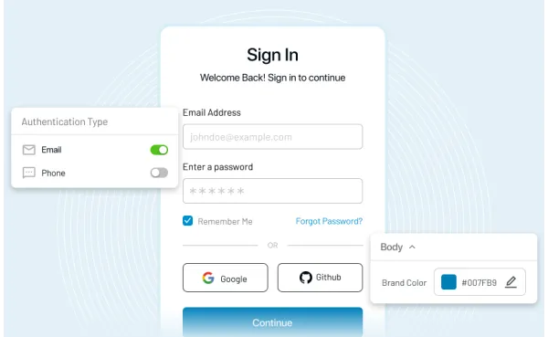
Did you know 90% of all product assessments are based on colors and 85% of buyers select a product on the basis of its color?
Hence, selecting a perfect color plan for your website is important. But, it can seem like a tough game- especially if you do not trust your color senses. I have seen people getting nervous or confused when it comes to decide a color scheme for anything. It may because they are not confident at the deciding stuff or may be they are color blind.
Fun Fact:- Mark Zuckerberg is red-green colorblind (that’s the reason why Facebook is blue).
So, coming back to the point, what’s your story? Do you also have these three questions while deciding your website’s color scheme:-
- What colors should your title or logo have?
- What are different colors that go well with different parts of website?
- Are there any good tools to make things a lot easier?
You can turn your website into a harmonious place or a piece from a horror movie with your color schemes. Hence, here I am presenting a guide to help you decide what is wrong and what is right for your website in terms of color scheme.
Influence of Color on your Business Identity
Whether it is your brand image or your website, colors can work like magic on your business. And while talking about the role of color in business, Coca Cola is the best example.
What are the things that come to your mind when I say the word Coca Cola? Obviously, a bottle of it. Then, the red logo of Coca-Cola. There was a reason why Coca-Cola chose the color “Red”.
Red shows excitement, passion and boldness and these were the emotions Coca-Cola wanted to convey with its product. Moreover, the color red makes it more visible on the shelves from its competitors. Well, here is an image showing reasons for different brands choosing respective colors in their logos.
Kissmetrics says that there is an 80% increase in brand recognition when colors are used.
So, how can you use colors to increase your brand recognition?
Create an awesome color scheme and here’s how you can create a color scheme:-
Cast Your Prominent Color
Your customers will connect their emotions with your brand through your prominent color. Hence, choose a color that convey the emotions about your company (like the red color in Coca-Cola does). Your logo should contain your prominent color as the primary color. However, if you have no clue which color to cast as your prominent color, see this image to decide the color of your choice.
You can also see for this chart to decide which colors to pick from the slot:-
Other than these psychological facts, you can check whether you are going to serve a youthful and energetic audience or your product is targeting a female audience. Hence, you have to decide the color on the basis of your targeted audience.
Fun Fact:- Do you know why hyperlinks are blue?
It is found out that most of the color blind patients are red-green color blinded just like Mark Zuckerberg. And almost no one in this world is blue-color blinded. It means that almost everyone in this world can distinguish blue from other colors and that’s why hyperlink’s default color is blue.
Some statistics that show what color do what men and women get attracted to while shopping
Also in another experiment, it was found that men preferred shades and bright colors while women preferred tints and soft colors.
By these data, you can certainly improve your color marketing strategies through color scheme.
Hence, it may be clear to you that personal decisions to purchase a thing are triggered by one’s own perception of himself or herself. If a person thinks of himself as elegant, attract him with black color. If a person enjoys trust and peace, attract her with blue color. I’m pretty sure that will work for you. That’s why I’m repeating that it is very important to know your target audience.
Using The Prominent Color
Now, let’s discuss about the areas on your website where we can use the prominent color. There is a simple thumb rule needed to be followed while using prominent color.
Only use prominent color on areas which you want to highlight to you customers like you logo, menu tabs, call to actions, and any important information. Here’s, how we do it at LoginRadius.
Using Accent Colors
Accent colors are the colors used for emphasis. Now, why do you want to use Accent colors when prominent colors are everything you need? Because your website will look boring if you use only a single color all over the place. Hence, to provide it a professional and interesting touch, you need to use accent colors on elements like quotes, subtitles and other information on your website.
For example, you can use accent colors on secondary information, current menu tab and basically those elements that aren’t the current primary focus but still you want them to be highlighted.
Also, do not use more than two accent colors on your webpages. It may confuse your prospects. Here’s a simple example to use accent colors on your website:-
Now, there are two ways to select your color scheme. Pursue a Phd career in color psychology or use these color matching tools to create a color palette (well, hiring a good designer may cost you more).
Tools for Creating Color Palette
1. Coolors
Coolors is an awesome site to generate color schemes. You can generate, store and share your favorite palettes within seconds in Coolors. The tool is available as chrome extension, an Adobe Add-on and as an iOS app.
2. Material UI Colors
Material UI Colors is from panda network which specializes to create color palettes for material designs. You can find a copy-paste option in the app for better color matching process. You can also try Flat UI Colors (from the house of panda networks) for flat UI themes.
3. Adobe Color CC
Adobe Color CC is a one-stop palette generator that allows you to generate color palettes with the help of its huge collection of color combinations (these combinations are created and curated by Kuler community).
4. Sporting Hues
The site basically supports sports colors and the categories are named as EPL, MLB, NBA and NFL.
Choosing the Right Background Color
Have you ever picked a wall color? If you have, you can easily relate to the process of selecting the website background.
When you are about to choose a wall color, you will make sure that the wall color adds to the comfort of the room. Not too strong and not boring as well. Moreover, you will choose different colors for painting a summer cottage and a retail store. Similarly, while choosing the right background color for your website entirely depends on the intent of your website.
Thus, here I have divided the websites into three types on the basis of their intent.
1. E-commerce or Content Driven Websites
You will find that majority of the content driven or e-commerce websites have neutral or white background. The intent of such websites is to promote their products or ideas rather than flashing the background of the website. Hence, the prominent and accent colors provide focus and personality to your website whereas the neutral background keeps your customers focused on your products or content.
2. Corporate Websites
Corporate websites are basically built with the intent of promoting services or promoting the brand. In both cases, different kind of colors would be used as the background color.
3. While Promoting a Brand
While you are promoting a brand, use your prominent colors as a part of your background. This will improve your brand recognition. You can take a look of our previous example Coca-Cola’s site to see how wisely and strongly they have used red on their website.
In case, you have a bold prominent color, then you can use less intense shades of the prominent colors. Here’s an example of how Cadbury does it:-
You can use the above discussed tools to choose different shades of your prominent colors that will go well with your website’s background.
4. While Promoting a Service or Product
Now, when you want your services to be the attention grabbers, use light colors for background as it will automatically highlight the content (product) on the page. Our web designers have done a good job highlighting our services.
5. Creative & Stylish Websites
When it comes to creative or stylish websites (creative, beauty, restaurant, design and fashion industries), you can use any colors in the background of your website. You can design a black background to provide a luxurious look or you can inspire your visitors with a rainbow background. Don’t lose your content’s visibility for the sake of charm on your website. Here’s a great template you can use for your creative website.
In a nutshell, the best background for your website will make your content more visible and will render a good feeling to your visitors while browsing. And still if you are struggling with the background color, use a light color for your background. Don’t expect your website to look inspirational enough, however, your content will be noticed.
Some Very Common Yet Important Tips
- Avoid using too much colors on your website. It may confuse your visitors. Moreover, it looks ugly.
- Don’t just use the color because that color is your favorite pick. It may not help the website.
- Do use some white spaces on your website. It improves your SEO, readability and ranks on sites like Google.
- Color is your visitor’s navigation guide. It will navigate them to important parts of your website. So, choose them wisely.
- The finest of designs cannot stop your customers to leave your website if they feel they need to stress out their brains to acquire information. They will look for some other sites that don’t. Hence, keep it simple and informative.
Examples of some awesome websites
Here are some websites you can take a look for some inspiration.
1. Departika
Specialty: Minimal yet effective
2. Magoz
Specialty: Vibrant
3. SecretKey
Specialty: Attractive combination of multiple colors
4. Softwaremill
Specialty: Beautiful yet elegant
5. Spektrum
Specialty: Wise usage of neon colors to give it modern touch
6. Enterprise England
Specialty: Beautiful color combination
While picking up a color scheme, you should always put your audience first and not your favorite color. Choose colors to make a long lasting connection and that’s how you will stand out from the competition. And although, choosing color scheme is an act of organization, objective and matching, don’t get daunted from adding different colors to your website. Have fun and let your content shine on your webpages.